Thursday, October 17, 2002
State Flags, Day 3
HAWAII

British Union Jack in upper left. Remainder of field consists of 8 alternating stripes of white, red, and blue.
Ahh! Busy lines! Colors are nice, but, umm ... Hawaii? You do realize you're part of the United States, right? Not the UK?
OK, the Union Jack symbolizes the previous kingdom's friendship with the British. Great. Welcome to the US. Doesn't really evoke Hawaii all that much, though.
Easily and often confused with British colonial flags. Hmm, I wonder why ...
Not too hard to reproduce.
They need a new flag. Really. Heck, replace the Union Jack with a pineapple or something and you're in business.
IDAHO

Blue field with Great Seal of the State of Idaho in the center. To reinforce whose flag it really is, a red band below the seal says "STATE OF IDAHO".
Oh, man, Idaho ... you have the words "STATE OF IDAHO" on there not once, but twice! With a seal! With detailed figures! UGH! The seal's pretty cool looking on its own, however.
The seal is pretty significant on its own, but we're not grading seals, we're grading flags.
Gee, you think the whole "STATE OF IDAHO" thing gives it away?
If you can draw a deer, Lady Justice, and a prospector with two cornucopia, have fun.
Yet another lame-ass flag with the seal in the center. It's like there's some crappy formula that old state legislatures had or something.
ILLINOIS

White field with Illinois state seal in center. Word "ILLINOIS" beneath seal in blue.
Another seal & words flag. At least Illinois' seal is big and not too detailed. OK, well, the eagle's pretty detailed.
Yeah, yeah, whatever ... National Unity, State Sovereignty. You had Lincoln. Yea.
Once again, the word "ILLINOIS" cries out for recognition.
Slightly better than some others.
Could be worse. Chicago's got a nice looking flag, though.
INDIANA

Blue field with a golden torch, surrounded by 19 stars -- an outer circle of 13, an inner semicircle of 5, and a lone star above the torch. The word "INDIANA" is curled above the top lone star.
The "INDIANA" takes it down from an 8 to a 6. This is a very solid flag but for that one transgression. Simple colors, relatively simple design.
Honestly, I have no idea what the torch means. It has become an effective symbol for Indiana, though.
Well, with the torch and "INDIANA," it's tough not to recognize.
A tad busy in the top, but pretty easily done with crayons. The flame is tough, at least for people like me without artistic talent.
Solid flag. Would be in the upper tier without the state's name on the flag.
IOWA
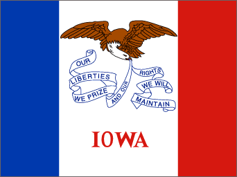
Vertical tricolor of blue, white, and red, with the white field twice the size of the blue or red fields. An eagle holds a ribbon with the state motto "Our Liberties We Prize, and Our Rights We will Maintain" in the upper white field. On the bottom white field is the word "IOWA" in red.
I want to like Iowa's flag. It starts out as such a simple design, then quickly descends into flag law hell with the eagle, ribbon, and WORDS!
"IOWA." State motto. Eagle. French immigrants. OK.
Once again, a state needs to put its name on its flag to get recognized. If you haven't noticed, I give baseline 5 scores here for states that have to scream their names without any other real recognizable features.
That scroll with the motto's a tough thing to overcome.
Very mid-range.
# posted by Eric @ 4:21 PM 
![]()