Thursday, October 31, 2002
Holy Cow
On a lark, I looked a little more closely at some of those pamphlets I linked to below. The money link is here. Scroll down a bit, to the thirteenth row of "cartoon" panels. The one on the right. Yeah, take a good look at it. That's no pentagram, boys and girls. Oh, no. It's a Star of David!! Way to show your true anti-Semitic colors, Chick! Oh, and nice polemics about us Catholics, too. "Whore of Babylon," worship of Mary and the Saints, non-Catholics doomed to hell, and all that shit. Lord knows I have some serious issues with the current state of things in the Church, but these people ... hoo boy. How sad that those who insist on taking everything in the Bible at face, fundamental value will so readily and happily contort allegorical constructs in Revelation to suit their own purposes and such.
Happy Friggin' Halloween
I've never really been a fan of this so-called "holiday," but I'm certainly not one of the religious anti-Halloween crowd. (For more fun, scroll down and check out the kind of "treats" they give kids! Fun for the whole God-fearing family! Check the box at the end and ensure eternal salvation!)
Yes, I know, I'm touching on two of the three deadly subjects today, but again, it's my blog. Political stuff is always fair game here. Religion, well, that might come up occasionally. With much mocking of people like that. Actually, notice how much those pamphlets resemble Democratic literature and propaganda on Social Security, Medicare, school lunches, education, and the all-important free prescription drugs for people who've lived X number of years. Damn, I resent that notion.
At any rate, after I turned, oh, 10 or so, the whole idea seemed a little silly, dressing up and going door to door asking for candy. I never really wanted for candy, and most of the time when I went trick-or-treating I got a bunch of crap like bubble gum or Hershey's dark chocolate. Dad would steal all the Butterfingers and Reese's Peanut Butter Cups. What was left generally amounted to about $3.00 worth of stuff I could have bought at the drugstore, and I think I figured this out pretty quickly. The reward wasn't worth the investment. Couple that with an aversion to makeup (I already had to wear the crap for choir and musicals, and that's not fun when you're 10) and a lack of interest in "scary stuff," and Halloween never really caught my interest.
Our home was, back then, in something of an undeveloped area, with very few other children around. It's different now, with several young families near us, so it will be interesting to see how the number of folks who come to our door this year compares with my memory from 1996, my last Halloween here. More than 10 groups would be a marked improvement.
The last time I "dressed up" for Halloween was in 1993. Sorry to say, I had to. It was a grade in my theater arts class. So I dressed up as a geek. (Yeah, yeah, "big stretch," I know. Stop laughing, Amie. You, too, Carey.) Needless to say, I did not go trick-or-treating that year. I did have two pretty good costumes in the past, though. When we were living in our first house, Mom sewed a shark costume for me. This was one hell of a get-up, let me tell you. She was promptly rewarded for her efforts by watching me get ill that night and only make it to the house across the street. I was required to wear it the next year, too. I won a prize for my 6th grade costume (last time I went t-o-t'ing) when I dressed up as a bum. This somehow included my Dad purchasing an actual cigar, clipping it, burning it a bit, and shoving it in my mouth as I made my way out the door. First time I ever "smoked." Definitely the last. I don't know how you smokers do it with cigars, let alone cigarettes ... man, that was vile.
So anyway, that's my general thought on this day. My 15-year old sister continues to dress up and go t-o-t'ing with her friends, much to my dismay. My younger brother gave it up soon after I did, and I think he's going to a party tomorrow with our German exchange student. Halloween's not a big thing in Germany, apparently. Charly only knew of "the thing with the pumpkin." I should have tried to talk up the Great Pumpkin, but I doubt it would have lasted long. Ahh, well ...
Quote of the Day
As seen on the Yahoo! Message board about the Democrat's ridiculous "memorial service" (aka political pep rally) for Paul Wellstone:
But cheer up, Dems ... in true Democrat fashion, I'm sure Wellstone will continue to vote, even if he is dead. Twice.
Time to sit back and watch the lawsuits fly. Minnesota, Missouri, and Louisiana all figure to be reenactments of Florida 2000. By all rights, New Jersey should be, too, but the Democratic apparatchiks control the place. Rules, protocol, and decorum mean nothing to that party when the loss of their own power is threatened.
Tuesday, October 29, 2002
Daily Wrap-up
- Tim has just started another interesting contest, The Jukebox From Hell. I'm going to make a not-so-bold prediction that "Macarena" will be crowned the horrendous winner.
- Dwight has some more responses to my thoughts earlier today. There's not too much more to say on circuit expansion, so I'll just encapsulate it here:
- Perhaps we're two ends of the spectrum on travelling -- I love it, and always enjoyed going to see other campuses. Yes, even when we didn't see much, or do much else there. Any chance to go somewhere new and compare mental notes was a thrill. The travel was, and continues to be, part of the overall experience, in my book. Maybe I'm just a nostalgic old fogey. YMMV, I guess. Subtle pun intended.
- "Should it matter?" Perhaps, but that was not the point. Reality shows us that it does matter. Fact is, people are much looser when spending other people's money, and the idea that more money is going to stay within the circuit doesn't hold much water. The only thing that will stay "in-circuit" are limited tournament profits, and that really just functions as funding redistribution, along with helping to fulfill other functions of tournament fees. If we lower average expenses throughout the circuit, the only "in-circuit" benefit we'd likely see is perhaps a minor influx of new / repaired equipment. Money will be spent on other things, guaranteed.
- As for the density issue, I'm just not buying it. Sure, a school with an enrollment of about 1,000 should be capable of supporting a team for a tournament a year, and that's where we get CBI schools. But to have a program, club, whatever, you're going to need about 10 people, or 1% of the total enrollment. I don't know of any circuit program that can claim to have 1% of the university enrollment involved. But, that 1,000-student figure also describes at least 33% of the high schools in America today. Focus the efforts there, first, and you might start making inroads to the smaller schools, but that's 10 years down the road, not 5. If teams spring up there in the interim, it's going to be due to the cult of personality.
- Perhaps we're two ends of the spectrum on travelling -- I love it, and always enjoyed going to see other campuses. Yes, even when we didn't see much, or do much else there. Any chance to go somewhere new and compare mental notes was a thrill. The travel was, and continues to be, part of the overall experience, in my book. Maybe I'm just a nostalgic old fogey. YMMV, I guess. Subtle pun intended.
- No state flags tonight, since I'm going to take the time necessary to have some good homages worked up for Texas, the obvious winner of the contest. The question now is who gets second place. Maryland's currently ahead, but Tennessee could knock them down.
- Despite the underwhelming response to the State Flags, I'm going to follow that contest up with a series grading national flags. Will Old Glory reign supreme? Not necessarily ...
Ironhead. Zest-Fully Trashy!
Carey and I went gold this morning with the announcements. Check out the Ironhead Quiz Productions page to see what we're talkin' about, Willis!
More Response
Dwight, my man ... I've got to take you to task again today. Point-by-point, followed by some summary.
- I don't believe I implied that your initial post was a front for NAQT, or that only NAQT will benefit from more teams on the circuit. Perhaps I should have been clearer, so here goes ... More teams on the circuit will, generally, mean more $$$ for you and NAQT, no matter how little. Hell, more teams on the circuit may help my bottom line before yours, but I think the point is that you have a vested institutional interest in seeing more teams on the circuit. It's likely to color your opinions.
- If more teams join the circuit, great. More power to them. I know that most of the established folks and programs will be happy to assist whenever possible, but we're not going to hold anyone's hand or do much serious work for them, either. Often, they're cool, but then again, they're often annoying as all hell, so that's why I think you see a lot of ... indifference ... to circuit expansion. It's more of a take it or leave it issue.
- Again, I'm not going to argue with the idea that quizbowl is fun, intellectually stimulating, etc. I like playing and will continue to do so whenever possible. I'll try to get others to try it. But I'm not going to start doing the Jehovah's Witnesses thing to proselytize for the circuit.
- We come back to the idea of critical mass. I'll say that there are four items you need to have a "program," no matter how small, join the circuit.
- At least one highly motivated player with some organizational skills who can get a group going through something of a cult of personality.
- At least one other (probably more) people also interested in playing, who are willing to give up weekends, etc. in order to do so.
- Money and transportation or institutional support.
- A spark or catalyst to set the wheels of organization in motion.
If one of these elements is missing, there's not much anyone outside that particular institution can do to help, other than try to provide the catalyst. More often than not, though, I think you're missing either #1, or the committed members of #2. I'm not going to cry over it, though. Also, in certain instances, you can do without #2, but these cases are really not "new" programs, but often graduate students who participated in the past.
- At least one highly motivated player with some organizational skills who can get a group going through something of a cult of personality.
- As for tournament costs, I think you're totally missing the boat here, particularly on two major points.
- By and large, we're not playing with our personal money, but the university's money. This makes a huge difference in how one approaches spending it.
- You're still neglecting the allure of travel in quizbowl. People like to go away for the weekend.
To elaborate, sure, if you're in the situation where you can go to closer tournaments, you're likely to take that option, but I think you may be overestimating the likelihood of teams ever having a good number of possible tournaments in day-trip distance. The geographic distribution of major four-year colleges and universities just doesn't really permit it. So, even if we have two local tournaments replace one regional trip (and for most schools, that is a big if), you're still not saving that much money. Plus, my suspicion is that teams would take the savings and apply them to a more "exotic" tournament trip. No real savings, then. Just a redistribution of travel costs. The only major benefit I'd see is if a team can regularly bring a large contingent (3+ teams) to tournaments. You'd see good cash savings there. Beyond that, I'm still not sold.
- By and large, we're not playing with our personal money, but the university's money. This makes a huge difference in how one approaches spending it.
- As for tournament fees, they serve a few necessary purposes. First off, they allow teams to defray the costs of the tournament, making copies, renting space, buying lunch / dinner for tournament staff, etc. Secondly, they give hosts an economic profit incentive to actually run a tournament. I'd suspect that most teams would rather play than read, but obviously someone has to run the tournaments for them to happen. This gives a little incentive. Tournament fees also serve a hugely useful purpose for motivating other teams to come to the tournament (by offering discounts to new teams, early packets, etc.) and to try to ensure that packets are received in a timely manner (or, if nothing else, duly compensate the overstressed editor). That last function needs some serious bite. Overall, I think an average tournament fee of $70-$80 is very reasonable, at about $20 per person. Circuit-hosted HS events are generally even more reasonable.
So, to give the promised summary ... I'm not wholly convinced that we need to worry about the lack of permanent growth on the circuit. The size will ebb and flow, but I honestly believe we've pretty well hit the maximum capacity. Expand a little more in high school, and we'll probably see a commensurate increase at the college level. I wouldn't mind being proven wrong about it, but I'm not going to keep myself awake at night worrying about it. If I had to worry about one thing in quizbowl, it would be the sorry state of question writing. More on that tonight / tomorrow.
State Flags, Day 8
OKLAHOMA

Sky blue field with an Osage Indian shield in the center. Shield is crossed by a peace pipe and olive branch. "OKLAHOMA" is directly beneath shield.
Words. Quasi-seals or detailed figures. Doesn't do much for me.
Well, there's the whole Indian Territory thing ...
Same ol', same ol' ...
Shield and odd "OKLAHOMA" font make for a tough one.
Oklahoma? OK ...
OREGON

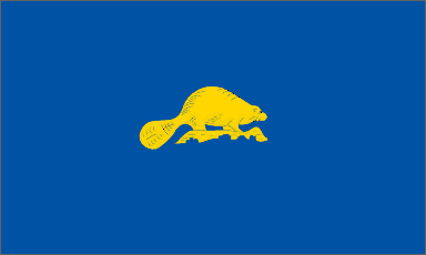
The only state with a double-sided flag with a blue field. Main side features gold state coat of arms on center. "STATE OF OREGON" above, and "1859" below. Reverse side features a gold beaver. For a description of the coat of arms, click the link.
Drab. Hideous. Breaks all three laws. If you're going to do a sea, please don't be monochromatic about it! Ugh.
It's the Beaver State.
"Hi, My name is _____"
No way.
Once again exerting editorial control to give this poor piece of crap a 1. Better than Georgia, but totally hideous otherwise. Please, Oregonians, vote yourselves a new flag. Spare us your beavers.
PENNSYLVANIA

Blue field with state coat of arms in the center. Coat of arms features two black draft horses flanking a shield, topped by a bald eagle. Ribbon below reads "LIBERTY, VIRTUE, AND INDEPENDENCE." Shield features a ship, a plow, and wheat.
Horses are generally cool, but not here.
Not much that screams Pennyslvania.
See above.
Horses, ribbons, shield ... not easily done.
Poor flag. Right up there with NY.
RHODE ISLAND

White field with a gold anchor in the center, surrounded by 13 gold 5-pointed stars. Blue ribbon beneath features state motto "HOPE" in gold letters.
Have to knock it down a bit for the word, but a very good flag besides that.
Anchor alludes to maritime stuff. Hope is state motto.
The anchor's a pretty good RI symbol.
Very simple and easy.
Good flags come from small states.
SOUTH CAROLINA
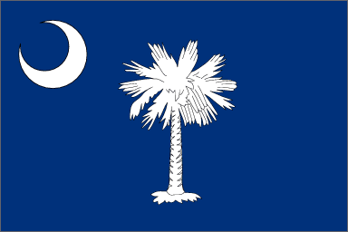
Blue field with a white crescent moon in the upper left. Center features a white palmetto tree.
A lot of vexillology folks like this one. I think it's OK.
Palmetto State and some Revolutionary War stuff.
See above.
If you can draw the tree you're in good shape.
Above average.
Monday, October 28, 2002
Circuit Expansion
Today's quizbowl commentary is largely a response to Dwight's October 27 post. Go ahead and read it first if you haven't already. I'll be right here.
OK. I think Dwight's working off a totally different premise from the legions of others who have made comments about the QB circuit's health and/or future. Most individual teams, etc., have no vested interest in circuit expansion on the collegiate level, whereas a company like NAQT does. The profit motive largely colors Dwight's comments, and so that's why I'm going to have to challenge him here. (No, there's absolutely nothing wrong with profit, being a company, etc. It's just that a vested interest in making money from the circuit is going to give one a different viewpoint. One I think is wrong.)
Let's start with Dwight's first premise:
There is an immense number of people not currently served by the circuit, who, if exposed to it, would like to be involved. This is true whether we are discussing the collegiate level, high school level, or even the post-college level.OK, I will agree that there are a large (I won't say immense) number of people who would, theoretically, be interested in playing circuit-level (HS, College, or Masters) quizbowl. However, preliminary interest does not necessarily continue through time and exposure. Nor does it account for the all-important motivation factor. Furthermore, these theoretically interested people are probably monodispersed throughout the institutions and locations thorughout America. In order to create something approaching a viable team or program, you need a critical mass of interested folks, and you need to bring them together.
I considered inserting a reaction kinetics analogy here, but I figured that it would either be totally lost on my readership if I explained it fully, or quite redundant to those who will grasp the picture merely by alluding to chemical kinetics. I'll briefly just say that you have a complex reaction with multiple reactants here, and the rate limiting reagent is a person with interest and organizational skills. Team creation is largely a spontaneous reaction, though it probably requires some catalyst. Places where the critical mass and catalyst exist already have teams, or will have them soon.
The problem, as I see it, is what constitutes our "catalyst." (I'm speaking largely in terms of the college circuit, so keep that in mind.) For schools out in the east / midwest / mid-Atlantic region, exposure to the circuit at large seems to be enough. There's just not enough of a true "circuit" out west and down south to sufficiently impact a team into wanting to join it. The whole mess is complicated by the limited number of people with the organizational skills / know how / desire.
Yeah, I'm rambling, but so what? It's my blog. The bottom line, I think, is that there are so many barriers to entry (Economics! Run!) that we are never likely to see any significant growth in the circuit, with certain established programs continuing as the Big Dogs, and other schools popping up occasionally, rising and falling with changing numbers of interested, motivated people. I know people hate the Dreaded Sports Analogy, but it really is like Division IA college football. The big programs are going to stay big, with other schools rising and falling. Barring something major, we are unlikely to see a major expansion into the south and west. We will see the large state schools and the top-tier private institutions dominate, since they will likely always have the critical mass. And you know what? I'm OK with that. You should be, too.
Dwight also mentions that he hopes for "[a] reduction in tournament costs such that everyone is able to play as much as they want." Again, it comes back to economics. Tournament entry fees are hardly onerous (I'm unaware of any instances of schools shirking tournaments because they were too expensive, though Penn Bowl's fees have become, shall we say, aggrivatingly high.), though the situation may be a little different for high school stuff. The major costs ae going to be tied up in travel expenses -- gas, van rentals, hotels, food, etc., and those are pretty well fixed. Even if we had such a dense circuit that a team could have a totally full schedule without making an overnight trip, part of the lure of collegiate quizbowl is the travel. I have always enjoyed seeing other campuses, and I imagine I'm not alone. Were we to lose this, it would be a shame. So, basically, I'd like Dwight to elaborate on that point.
I might have some other stuff later, but that's it for now.
Anaheim Wins
Well, I had Anaheim making it to the ALCS, but losing to Oakland. Whoops. I also had SF losing in the Divisional Round. Not a particularly great World Series this year, though it was compelling at times, particularly Games 2 and 6. Barry broke out of his postseason blues, but one man cannot win the World Series. Great team effort by the Angels all year long. Mike Scoscia should be a shoo-in for Manager of the Year honors, and Troy Glaus was as deserving as anyone else for Series MVP. I know my old college buddy Helio is a happy camper right now, and I wouldn't be surprised if he scored Game 7 tickets himself, the lucky punk. So congratulations to the Angels, the ghost of Gene Autry, and yeah, even Disney. (It was painful at times watching FOX have to tout Disney.)
Baseball thoughts now turn to free agency and hopes for next season. Sadly, I think the Astros are going to again be a team in decline, as the Baptist Grocer continues to try to squeeze every penny possible from the fans without putting much back in. Berkman will continue to be a beast, and Oswalt, Miller, Redding, Hernandez, Wagner, and Dotel will still anchor the pitching staff, but everything beyond that is very much up in the air. Will Biggio's skills decay even further? Will Bagpipes start to follow Biggio down that chute? Will anyone on the left side of the infield stand up (Blum's too much of a wildcard)? Will Ausmus learn to hit? Can we dump Hidalgo on some backroad in Venezuela along with Tony Eusebio?
Still, if the Angels can finally win a World Series, there is hope for Houston. Someday. Hopefully before I die.
State Flags, Day 7
Into the home stretch, sorta ...
NEW MEXICO
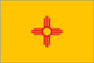
Yellow field with a red sun symbol (from the Zia Indians) in the center.
Boom! This is what a good flag looks like. Simple, to the point, and effective. Not quite 10 level (almost too simple), but very close.
Yellow and red for the old Spanish colony days, and the sun is an effective symbol of the Southwestern Indian population.
The Zia sun symbol = New Mexico.
Piece of cake.
One of the nation's best flags.
NEW YORK
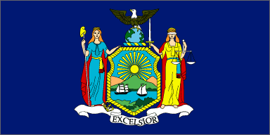
Dark blue field with the state coat of arms in the center. Coat of arms features Liberty and Justice flanking a shield, which depicts a Hudson River / boat scene. Below the shield is a ribbon reading "EXCELSIOR," while above it is an eagle sitting atop the globe.
Snoozeriffic and annoying. At least the words are minimal.
Yeah, that REALLY looks like the Hudson River, though one might take the eagle on the globe to imply Empire State.
Doesn't say "NEW YORK," but how many people know "EXCELSIOR" is NY's motto?
Detailed figures. Need I say more?
I Don't Love New York.
NORTH CAROLINA

Blue union spans the full hoist of the flag. Remainder of fly is a red bar atop a white bar. Center of the union rectangle features a small white star with the letters "N" and "C" flanking it. Above the star & letters is a ribbon reading "MAY 20, 1775." Below is a ribbon reading "APRIL 12, 1776."
Yes, this looks like the Texas flag. They ripped us off. Then added words. Morons. (NC adopted 1865. Texas adopted 1839.)
Originally, the April 12, 1776 thing was May 20, 1861, for NC's secession. They changed it after the Civil War. Still, this is pretty lame.
You'd have to be a blithering idiot or not American to not equate NC with North Carolina.
Not too hard.
They need a new flag, too. It could be a lot better.
NORTH DAKOTA

Blue field with American Eagle in the center. Eagle holds arrows and olive branch in its claws, and an "Old Glory" shield on its breast. In its beak is a ribbon bearing the words "E PLURIBUS UNUM" and above that is a fanning sun containing 13 stars in two semicircles. Beneath the eagle is a banner reading "NORTH DAKOTA."
First and Third Laws broken here. Looks more like a cabinet office flag than a state flag.
Well, there's no mistaking that North Dakota's a US State ...
Highest score they're getting.
Eagle and Ribbons. No joy.
Wow. You'd think they'd have more time to come up with something good in North Dakota.
OHIO

One of the few official pennant flags in the world, the swallowtail design is the "Ohio burgee." Field consists of a blue triangle and five alternating red and white stripes. In the blue triangle are two concentric circles (red inside white), surrounded by 17 stars, in groups of 13 and 4.
It's unique, it's a pennant, it's fairly simple color-wise ... Ohio is cool.
There's kind of an O there ... and it was the 17th state ...
It's all about the burgee, baby.
Simple, but the pennant makes for some odd angles.
It's a good thing.
Wednesday, October 23, 2002
OOPS!
How embarassing. I don't know if I would have even noticed it had I been listening, and if I had, I can't say whether I'd have laughed or been offended. Probably a little of both.
Quizbowl Thoughts
In response to things posted by Dwight and others in the IRC chat and over at the Quizbowl Yahoo! group, I'm going to start posting some quasi-rambling thoughts on issues as my thoughts on them coalesce. Lucidity is not guaranteed here, but I encourage comments and feedback, as always. (BTW, thanks for reading, Brian)
On Graduate Students and Other Dinosaurs:
I’m one of them now. Yip-yip-yip-yip-yahoo! I’m also really not that great of a player. On a team of four, I’d probably make a good second chair / captain, since on typical ACF / NAQT type questions my PPG is somewhere around 30-40. This goes up to about 50-60 when playing solo or as the go-to-guy on my squad. All Star Level? Maybe, but nothing to get overly excited about. Plenty of undergraduates have and will continue to hand me solid defeats. Now that I’m playing solo, and doing so in a region whose circuit is not exactly powerful, I’m still not likely to crush even the youngest teams I face.
Case in point, I narrowly beat a weak Rice B team 115-110 last weekend on BRRR questions. Granted, I whammied four bonuses, but still, they could have answered a single additional bonus part and won the game. I certainly wasn’t holding back their progress or confidence.
So, in terms of playing in tournaments, writing questions, etc., I think that the suggestions and implications that graduate students and older folks are ruining the game and upping difficulty is a whole lot of bunk. Others have made this argument a bit more eloquently than I, so I won’t rehash their points on this one.
That being said, however, I do think that graduate students, older players, and even the top-notch undergraduates can hurt the development and such of younger and newer players … during practice. We often go full speed in practice, nailing tossups extremely early and cutting off bonuses before the parts are finished being read. While simulating game experiences and allowing top-tier folks to flex their proverbial QB muscles, it does little good for new folks to sit there dumbfounded as one line is read of a tossup and an answer which they may or may not be familiar with (let alone actually hear clearly) is quickly given. Newer and younger folks need to hear full questions, even if someone has already nailed it, so that they can begin to make the connection between clues and answers. This is so imperative, and I believe that too many potential players are being scared away.
So, my message to the top-level players of today: hold back on a packet or two in practice. Hold off answering until the tossup is done. Hell, buzz in in your head and keep your own score for all I care. Before anyone accuses me of coddling new players, consider this: you’d be amazed how much answering a question or two at practice encourages otherwise marginal players to get better, attend more practices, write questions, and help out at tournaments. I’ve seen it happen. They may not become the next God or Goddess of QB, but we need people willing to do the work at all levels.
Tuesday, October 22, 2002
State Flags, Day 6
Whoa, today really is a BloggEruption ... Onward to the flags!
MONTANA

State seal sits in the center of a blue field. Above the seal is the word "MONTANA" in gold letters. Seal features a mountain and waterfall scene, with a plow, shovel, and pickaxe above the state motto "ORO Y PLATA" or "Gold and Silver."
Seal. Words. Lame.
The motto and some mountains. Meh.
Standard "MONTANA"
Seal is a toughie.
Another cookie-cutter lame flag.
NEBRASKA

Blue field with state seal in gold and silver on center.
Very drab.
What, a blacksmith and a train, but no corn?
Cookie-cutter ...
Montana's looks better.
NEVADA
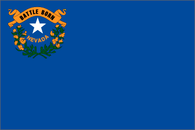
Blue field with detail in upper left corner. A white star is surrounded by a half wreath of sagebrush below and a ribbon reading "BATTLE BORN" above. Immediately below the star is the word "NEVADA."
Odd, having the seal-like detail in the upper left.
Not sure what "Battle Born" means. Sagebrush refers to desert climate.
The "NEVADA" gets the standard score.
Fairly easy compared to others.
Could be much worse ... thank you for not featuring Vegas.
NEW HAMPSHIRE

Blue field with state seal in center. Seal is surrounded by nine stars amidst a laurel wreath. Seal features a sailing ship and sunrise.
About as good looking as Montana's, without the annoying "STATE NAME" phenomenon (ok, it's on the seal).
I know that NH has a coast, but I don't really think ships when I think NH.
Standard score.
Seal is busy and detailed.
Boring.
NEW JERSEY

Buff colored field with state coat of arms in the center. Coat of arms features three plows on a shield, goddesses representing liberty and agriculture, a horse's head, and a ribbon with the slogan, "LIBERTY AND PROSPERITY" and the date 1776.
First, Second, and Third Laws broken here.
Anyone else find the horse head oddly appropriate for New Jersey? Bada-bing!
Nothing to really distinguish it here ...
Detailed figures. Yeah, right.
Fuhgeddaboudit!
Van Halen
A small response to Carey's analogy, as posted over on Dwight's site. It is an interesting analogy, if perhaps extended too far ...
Roth and Hagar did go on tour together (whether it's still going on now, I can't say) and they came to Houston back in June or so. I would have gone, but we were at NAQT HSCT. Hagar's the better solo performer -- he plays guitar as well, and can do a bit better writing, etc. But, to borrow a phrase from Capt. Spock, it was a mistake for Roth to ever accept promotion to a solo tour. Being the frontman for a power rocking group was, and continues to be, his first, best destiny.
I mean, honestly, can anyone else on earth use their voice so effectively as to mimic Eddie Van Halen's wailing on the electric guitar? Just listen to anything on 1984, particularly "Jump" and "Panama." (Incidentally, "Hot for Teacher," while not explicity utilizing Roth's full vocal range, is perhaps the single most hilarious song/video combination of the MTV generation. Not only that, it's a damn fine song by itself. And recall that no one really knows what became of Waldo ...)
Hagar's going to go down as a better solo act, IMHO, based largely on the strength of "(I Can't Drive) 55" -- recall that the Hagar-led Van Halen never attained the success that the Roth-led Van Halen did. The song writing during the era was better, though I think the actual musical work was subdued, at best. Nothing uniquely innovative in the way that 1984 was, other than some interesting stuff in the "Right Now" video.
Always happy to be "Your Guide," :-)
(anyone remember that?)
Ouch
Damn, you EA Sports. Damn you, John Madden. Damn you, CPU Robo-QB. I just literally punched a divot in the wall of my room. I think the stress from the Mathematical Methods class is starting to get to me ...
Time to break out the drywall and paint ... oh well ...
And while I'm at it, I'm going to rant for a second about some political campaign ads. Please tell me what the following things have to do with one's ability to serve as governor, congressperson, or other state office:
Houellebecq Cleared
A marginal victory in France for free speech, as evidenced by the refusal of a three-judge panel to convict Michel Houellebecq for "inciting racial hatred" by calling Islam "a stupid religion." Just a reminder that the rest of the world does not enjoy anywhere near the number of constitutionally enumerated and protected rights as we do here in the USA. Strange, though, how stories like this are generally ignored by the same folks who ask us to constantly follow the advice of the EuroElite.
The money quote from the article comes from Dalil Boubakeur of the Paris mosque:
Islam has been reviled, attacked with hateful words. My community has been humiliated.
All because Michel said that Islam was stupid? Wow, I knew the French were a bunch of wimpy ninnies, but apparently French Muslims are even wimpier. The only alternative explanation for the apparent wimipiness is that these four Muslim groups just wanted to see someone go down and punished for publicly speaking any words against Islam. But we know that they would never do anything like that, right?
Monday, October 21, 2002
Kung Pao!
For anyone interested in seeing the recipe to my best and favorite dish, check out Chez Steiny right now! And, as always, feel free to leave a comment here.
State Flags, Day 5
And the lame-o flags just keep on coming ...
MASSACHUSETTS

White field with state coat of arms in center. Coat of arms features a Native American with bow and arrow and a white star. Scroll around flag reads "Ense Petit Placidam Sub Libertate Quietem," or "By the Sword We Seek Peace, but Peace Only Under Liberty."
Violates the First and Second Laws, but the lack of garish colors and a fairly simple coat of arms limits the damage.
The Massachuset Indian is OK, but it's not immediately apparent that it's MA. The arm and sword above the shield goes well with the motto.
You'd probably guess that it's one of the 13 colonies, but nothing really distinguishes it as Massachusetts.
Easier than some others.
A minuteman instead of a Native American would work much better.
MICHIGAN

Blue field with a coat of arms in the center. A moose and elk flank a blue shield that reads "TUEBOR" and pictures an armed man overlooking a sunrise over a lake. A bald eagle sits atop shield, and a red scroll reading "E PLURIBUS UNUM" is above. Below the shield is a ribbon reading "SI QUAERIS PENINSULAM AMCENAM CIRCUMSPICE."
Busy. Busy, busy, busy, busy. A moose AND an elk? Three instances of words? Detailed figures to the max? Argh!
Supposedly the moose and elk are symbols of Michigan. News to me ...
Really not much to signify Michigan to other Americans.
Please.
Whoa. Lowest score straight up.
MINNESOTA

Deep blue field with state seal in the center. Seal features a farmer and Native American surrounded by a wreath with three dates: 1819, 1858, and 1893. Outer circle of seal depicts 19 stars and "MINNESOTA."
Very busy, though the figures aren't that detailed.
The dates refer to Minnesota history, as do the farmer and Native American. The wreath features the state flower, so that's OK>
Standard "Hi, my name is ... " score.
Small, crowded seal.
Pretty boring.
MISSISSIPPI

Horizontal tricolor of red, white, and blue. CSA battle flag in the union square.
Many object to the CSA battle flag. I don't mind it, but I have to acknowledge the controversy. Objectively, though, it's a nice, crisp design.
Very obviously a southern state, though it doesn't really delineate MS.
With the demise of GA's old flag, the only one with the actual CSA battle flag left.
Pretty easy.
The Confederate controversy knocks it down. Would probably be a 25, otherwise.
MISSOURI

Horizontal tricolor of red, white, and blue. State seal in center surrounded by anouter blue band with 24 white stars. Seal features two grizzly bears and a lot of other crap. Check the link for a better description of the seal.
Seal with words and detailed figures knocks it down.
Twenty-fourth state. Date of admission. Grizzly bears????
Somewhat well-known, but the bears will throw you off. Since when did MO have bears?
Seal is a toughie.
Show Me a better seal!
Friday, October 18, 2002
Take Back the Night?
Instead of trying to come up with good, positive solutions, the usual SGB suspects are going to "TAKE BACK THE NIGHT!" with bullhorns and posterboards. They're also furthering the lie about rape and sexual assault being so prevalent on American college campuses.
Note that they never merely say rape, but they must also include sexual assault, whose definition is so nebulous that your average activist feminist researcher can quasi-plausibly include being hit upon or longingly gazed at as a sexual assault. But I'm getting off the point.
What criminal minds, praytell, will suddenly decide to give up their treacherous ways after a bunch of crop-haired CWO types go tramping across Oakland chanting various gobbledygook and saying "no to violence on campus"? I'll tell you how many -- ZERO.
Contrast this action with that of Charmaine Dunbar in the East End who singlehandedly stopped a serial rapist with two .357 slugs to the abdomen of the SOB who threatened her.
Criminals respect one thing and one thing only -- deadly force.
Thursday, October 17, 2002
State Flags, Day 4
OK, yes, I'm ostensibly posting this the same day as Day 3. I was busy with homework this week, so I'm catching up.
KANSAS

Blue field with state seal in the center. Above the seal is a sunflower sitting atop a bar of blue and gold. Below the seal is the word "KANSAS" in big gold letters.
Snoozeriffic. Words and seals, again, but Kansas' seal isn't even that interesting. The sunflower is the only saving grace.
The sunflower is cool, but the seal doesn't really even differentiate it from other midwestern states all that much, unless you happen to know the order of admission into the Union. Hence, they put "KANSAS" in big letters at the bottom.
Standard 5 score for being unoriginal.
Doable by someone with patience.
As boring as the state.
KENTUCKY

Blue field with seal of Commonwealth of Kentucky in the center. Seal features statesman and pioneer, with goldenrod surroundings and motto "United We Stand Divided We Fall."
Words, seal, and detailed figures. Not appealing at all.
State motto and the statesman/pioneer legacy, but that's also with Tennessee, so it's not too unique.
"COMMONWEALTH OF KENTUCKY." Take that away, and what have you got? A whole lotta nothing.
Simple seal, but the goldenrod and the figures are tough.
Yawn.
LOUISIANA
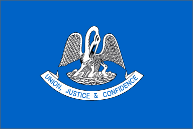
Light blue field with pelican grouping in center. Below central figures is a white scroll with blue lettering "UNION, JUSTICE, & CONFIDENCE."
For simple colors, man is this boring. It's still got the detailed figures and words. Won't these states ever learn?
Pelican state. I'll give LA that.
How many people outside of the south recognize LA as the Pelican State?
Tough figures to draw.
Neighbors to the east fail to live up to their firey reputations.
MAINE

Blue field with state coat of arms in the center. Coat of arms features a farmer, sailor, moose, North Star with the motto "VIRIGO" beneath, and a bottom ribbon with the word "MAINE".
Hey, it's a coat of arms instead of a seal this time! Cooler than it should be, but it still violates too many flag laws.
I'm sure it means something to Maine folks.
Heck, the "MAINE" on the coat of arms is tough to read.
Way too detailed for a kid to draw.
Barely avoids single digits.
MARYLAND

Four quadrants -- upper left and lower right feature part of the Calvert family crest. Upper right and lower left feature Crossland family crest.
It can be a bit busy, but this is what a good, solid flag looks like when done well. Four, simple colors. Regular patterns.
Totally synonymous with Maryland, particularly the black and yellow checker design.
As above ... usually easily recognized by Americans.
Tough to get perfectly, but certainly possible to do it justice.
One of America's best state flags, by far.
State Flags, Day 3
HAWAII

British Union Jack in upper left. Remainder of field consists of 8 alternating stripes of white, red, and blue.
Ahh! Busy lines! Colors are nice, but, umm ... Hawaii? You do realize you're part of the United States, right? Not the UK?
OK, the Union Jack symbolizes the previous kingdom's friendship with the British. Great. Welcome to the US. Doesn't really evoke Hawaii all that much, though.
Easily and often confused with British colonial flags. Hmm, I wonder why ...
Not too hard to reproduce.
They need a new flag. Really. Heck, replace the Union Jack with a pineapple or something and you're in business.
IDAHO

Blue field with Great Seal of the State of Idaho in the center. To reinforce whose flag it really is, a red band below the seal says "STATE OF IDAHO".
Oh, man, Idaho ... you have the words "STATE OF IDAHO" on there not once, but twice! With a seal! With detailed figures! UGH! The seal's pretty cool looking on its own, however.
The seal is pretty significant on its own, but we're not grading seals, we're grading flags.
Gee, you think the whole "STATE OF IDAHO" thing gives it away?
If you can draw a deer, Lady Justice, and a prospector with two cornucopia, have fun.
Yet another lame-ass flag with the seal in the center. It's like there's some crappy formula that old state legislatures had or something.
ILLINOIS

White field with Illinois state seal in center. Word "ILLINOIS" beneath seal in blue.
Another seal & words flag. At least Illinois' seal is big and not too detailed. OK, well, the eagle's pretty detailed.
Yeah, yeah, whatever ... National Unity, State Sovereignty. You had Lincoln. Yea.
Once again, the word "ILLINOIS" cries out for recognition.
Slightly better than some others.
Could be worse. Chicago's got a nice looking flag, though.
INDIANA

Blue field with a golden torch, surrounded by 19 stars -- an outer circle of 13, an inner semicircle of 5, and a lone star above the torch. The word "INDIANA" is curled above the top lone star.
The "INDIANA" takes it down from an 8 to a 6. This is a very solid flag but for that one transgression. Simple colors, relatively simple design.
Honestly, I have no idea what the torch means. It has become an effective symbol for Indiana, though.
Well, with the torch and "INDIANA," it's tough not to recognize.
A tad busy in the top, but pretty easily done with crayons. The flame is tough, at least for people like me without artistic talent.
Solid flag. Would be in the upper tier without the state's name on the flag.
IOWA
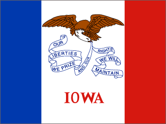
Vertical tricolor of blue, white, and red, with the white field twice the size of the blue or red fields. An eagle holds a ribbon with the state motto "Our Liberties We Prize, and Our Rights We will Maintain" in the upper white field. On the bottom white field is the word "IOWA" in red.
I want to like Iowa's flag. It starts out as such a simple design, then quickly descends into flag law hell with the eagle, ribbon, and WORDS!
"IOWA." State motto. Eagle. French immigrants. OK.
Once again, a state needs to put its name on its flag to get recognized. If you haven't noticed, I give baseline 5 scores here for states that have to scream their names without any other real recognizable features.
That scroll with the motto's a tough thing to overcome.
Very mid-range.
Saturday, October 12, 2002
State Flags, Day 2
COLORADO

Horizontal tricolor of blue, white, and blue, with a red circular "C" beginning at 1/5 fly, the interior of which is a gold circle.
The "C" comes very close to violating the First Law. Other than that, the simplicity of the bars and circles works.
"C" is for "Colorado," or maybe "Centennial"? Gold is for gold in them thar' hills. Official flags are supposed to have gold & silver fringe, so that's an extra point.
The red "C" with gold circle is a major Colorado symbol, pretty well unmistakeable. Very familiar to lots of people.
Simple, elegant. Somewhat odd placement of "C" knocks it off a bit.
A strong flag worth celebrating.
CONNECTICUT

Azure field with white shield featuring three grapevines. Ribbon script below reads "Qui Transtulit Sustinet" or "He who transplanted, sustains."
Our first dog of the contest. Violates the First Law (words suck) and the Second Law (seals suck). The fact that it's a nice blue stops the shutout.
Supposedly the grapevines represent the "transplanted" MA colonists. So if you associate grapes with CT, there you go. The slogan also leaves something to be desired, but it fits the flag.
Again, why would anyone not from CT associate it with grapevines?
Seals, vines, ribbons, etc. Business and such abounds.
First one in single digits, but definitely not the last
DELAWARE

Colonial blue field with inset "buff" diamond. Diamond features coat of arms with a ship, farmer, soldier, wheat, corn, cow, and scroll with the words "Liberty and Independence." White words "December 7, 1787" are at bottom.
Wow. Color and layout are the only saving graces here. Violates First Law with egregious words, Second Law with a busy seal, and the Third Law with detailed figures. A farmer AND a minuteman? Yikes ...
Colors are for Washington's uniform, and the various stuff in the coat of arms is significant. December 7, 1787 is most significant as it marks the day DE became the first state to ratify the Constitution.
This certainly makes an impression ... the date is key, however.
Forget it. The diamond and date are doable. But two people, a ship, and a very detailed shield? Not easily reproduced by any means other than Xerox.
Saved by its significance and the fact that it's so awful it can be remembered.
FLORIDA

Red Cross of St. Andrew on a white field, with the Great Seal of the State of Florida set at the cross' center
The seal, while violating all three Laws, is visually appealing when set against the cross.
St. Andrew's Cross = CSA. Seminole, ship, and sunshine represent FL well.
It does say "FLORIDA" on the seal. Possibly confused with Alabama if one can't read or make out the seal.
It's the seal, people. Colorful and busy means difficulty.
Surprisingly high, given the seal's transgressions. Though really, since it's all in the seal, it's just a violation of the Second Law.
GEORGIA

Blue field with Georgia's seal in top middle, surrounded by 13 white stars. Bottom ribbon displays "Georgia's History" -- the three previous state flags surrounded by the 13 state Stars & Stripes and the current US Flag. Beneath that is "In God We Trust." Adopted January 2001 in the aftermath of protests over the CSA battle flag's presence on the previous flag.
Busy, busy, busy. Words. Seals. Mini-flags. This is a PC-ified banner masking as a flag. What a piece of shit.
I guess the state seal means something to Georgians. Plus, we don't want to offend anyone so we'll put everything on here. Sheesh.
"GEORGIA." "Georgia's History."
Very simply done in Photoshop. Wouldn't surprise me at all if this is what they did.
I'm stepping in and giving a big fat zero to this politically correct garbage. If they wanted to replace the CSA battle flag, fine. But this is what you get when you have a bunch of legislating morons do things in committee. Worst Flag Ever.
Thursday, October 10, 2002
State Flag Showdown
Many people who know me also know that I have a penchant for vexillology. I like flags. Why? I don't know. It probably stems from an assignment I was given by my G/T teacher in 4th grade, where I had to research the history of flags and give a little presentation to my G/T class about them. Why did I get that assignment? I was probably the only one who was boring enough to do it. Anyway, I got hooked on learning about flags of all states and nations.
So, with props to Craig for his Music showdown, I'm going to have a little flag beauty pagaent of my own over here. Five state flags a day over 10 days in alphabetical order. Judging criteria will be as follows:
So, here we go with the first 5:
ALABAMA

Crimson Cross of St. Andrew on white field. Adopted in 1895 to resemble CSA Battle Flag
Sort of bland. Scottish flag with English colors. One of the few near-square flags still around.
CSA is the only thing going on here.
Possibly confused with Floridian, English or Scottish flags. Not very original or distinctive.
I could do this with in my sleep
Lame beginning
ALASKA

Gold stars comprising Big Dipper and Polaris on blue field. Adopted in 1956
Looks like it was designed by a child ... oh, wait, it was.
OK, I get the North Star bit with Alaska being up north, last frontier, etc. Please remind me what the Big Dipper has to do with Alaska again?
Fairly distinctive and simple to recognize.
Simple design.
Is it really lamer than Alabama's? Yeah, Alaska is big, but it's a whole lotta frozen junk.
ARIZONA

Thirteen rays of red and gold form the top half over a bottom field of blue. A copper star in the middle creates a sun-like effect.
Rising / setting sun type effects are always cool. Good, crisp colors and sharp design.
Copper star for Copper State. Apparently the 13 rays are for the 13 colonies, but that's a little odd for Arizona to care about. Red and gold reminiscent of Spanish settlers.
Very visible symbol for Arizona.
The ray effect is always difficult to reproduce, but it looks very nice when done well.
A top-rank flag, definitely
ARKANSAS

Blue diamond with white interior diamond on a red field. "Arkansas" emblazoned on inner diamond. 25 white stars in blue diamond, 4 blue stars in white diamond.
Busy. Boring. Violates Eric's First Law of Flags: "Words on flags suck."
White stars in blue diamond reminiscent of CSA days. Diamond shape for diamonds found in state. "ARKANSAS" to remind the local yokels where they are. 25 stars for the 25th state. The four blue stars are supposed to represent Spain, France, CSA, and USA ... whatever.
It doesn't bother to symbolize. It just says, "Howdy, thar ... we're Ar-Ken-SAW." It also used to mean clean rest stops, but not anymore.
Lot of stuff going on, but simple in concept. Stars are at odd angles, though.
Not too good, but certainly not among the worst.
CALIFORNIA

Left-facing Grizzly bear on a green patch over a white field. "CALIFORNIA REPUBLIC" emblazoned beneath bear and above red bar. Red star in upper left corner.
Violates Eric's First Law with "CALIFORNIA REPUBLIC," but the Grizzly makes up for it. Red star and bottom bar are unexpected touches that add appeal. (Though today one might question just what that red star means ...)
Good history with the flag, but the lone star is (intentionally) derivative.
Again, screams it in your face, but the bear is pretty recognizable nonetheless.
Depends on your tolerance for crappy looking bears. Most will forget the grass beneath its feet.
A little lower than I expected, actually. Very recognizable and acceptable symbol for CA, though I'd assume most Americans would know CA's flag from various courtroom scenes.
Meesa Back
Damn, grad school is busy. I'm going to experiment over the next month or so with more of a daily log type style of blog. Not quite diary, not quite commentary. Somewhere in the middle ...
That having been said, a quick look at the Nobel citation for Literature Prize winner Imre Kertesz includes this little nugget:
"The refusal to compromise in Kertesz's stance can be perceived clearly in his style, which is reminiscent of a thickset hawthorn hedge, dense and thorny for unsuspecting visitors," the citation said.Translation: His work is totally inaccessible for the general population and will continue to be unpopular for generations to come, largely because he writes about one thing and one thing only.
In a roundabout, cynical way, I can't help but wonder if this is a calculated attempt by the Euro-Elite to justify their ridiculously high levels of hostility towards Israel (and the growing anti-Semitism in Western Europe) by throwing the prize this year to an overtly Jewish writer whose entire career revolves around the Holocaust.
Also, looking at Imre's picture, I can't help but thinking that he looks exactly like a Chemistry professor.
![]()