Thursday, October 17, 2002
State Flags, Day 4
OK, yes, I'm ostensibly posting this the same day as Day 3. I was busy with homework this week, so I'm catching up.
KANSAS

Blue field with state seal in the center. Above the seal is a sunflower sitting atop a bar of blue and gold. Below the seal is the word "KANSAS" in big gold letters.
Snoozeriffic. Words and seals, again, but Kansas' seal isn't even that interesting. The sunflower is the only saving grace.
The sunflower is cool, but the seal doesn't really even differentiate it from other midwestern states all that much, unless you happen to know the order of admission into the Union. Hence, they put "KANSAS" in big letters at the bottom.
Standard 5 score for being unoriginal.
Doable by someone with patience.
As boring as the state.
KENTUCKY

Blue field with seal of Commonwealth of Kentucky in the center. Seal features statesman and pioneer, with goldenrod surroundings and motto "United We Stand Divided We Fall."
Words, seal, and detailed figures. Not appealing at all.
State motto and the statesman/pioneer legacy, but that's also with Tennessee, so it's not too unique.
"COMMONWEALTH OF KENTUCKY." Take that away, and what have you got? A whole lotta nothing.
Simple seal, but the goldenrod and the figures are tough.
Yawn.
LOUISIANA
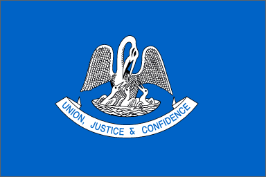
Light blue field with pelican grouping in center. Below central figures is a white scroll with blue lettering "UNION, JUSTICE, & CONFIDENCE."
For simple colors, man is this boring. It's still got the detailed figures and words. Won't these states ever learn?
Pelican state. I'll give LA that.
How many people outside of the south recognize LA as the Pelican State?
Tough figures to draw.
Neighbors to the east fail to live up to their firey reputations.
MAINE

Blue field with state coat of arms in the center. Coat of arms features a farmer, sailor, moose, North Star with the motto "VIRIGO" beneath, and a bottom ribbon with the word "MAINE".
Hey, it's a coat of arms instead of a seal this time! Cooler than it should be, but it still violates too many flag laws.
I'm sure it means something to Maine folks.
Heck, the "MAINE" on the coat of arms is tough to read.
Way too detailed for a kid to draw.
Barely avoids single digits.
MARYLAND

Four quadrants -- upper left and lower right feature part of the Calvert family crest. Upper right and lower left feature Crossland family crest.
It can be a bit busy, but this is what a good, solid flag looks like when done well. Four, simple colors. Regular patterns.
Totally synonymous with Maryland, particularly the black and yellow checker design.
As above ... usually easily recognized by Americans.
Tough to get perfectly, but certainly possible to do it justice.
One of America's best state flags, by far.
# posted by Eric @ 4:44 PM 
![]()